Written by our longest serving Wonky Wrangler, Kim Dovey
Wonky and I have a few things in common these days. Just as he was going viral, I was having retina surgery, which left me very one-eyed. Not a good look when you’re trolling back through the archives looking for some of the early Wonky designs and conversations back in 2009.
It’s been a super fun trip down memory lane, starting with this email from Scholastic’s Senior Editor, Penny. This all kicked off after their trip to Christchurch, which I have described in my Linkedin article here.
March 2009
Email from Penny, Senior Editor at Scholastic NZ
Subject: New Book
Morning, sunshine!
As you know, we contracted the singer from the Te Tai Tamariki function last year and will be producing his book The Wonky Donkey for Xmas this year. The illustrator also lives in Christchurch (see roughs attached) and I would like you to meet with her when we’re down on the 27th, if possible, as we need some special attention given to this book. Andrew [from Scholastic Australia] is very excited about it and is taking it for his Xmas list as well. Trouble is, Katz [the illustrator] works during the day, so is wanting to meet at 5.30 Friday evening. I’m checking with Kathy to see if it’s convenient for us to meet at the Scholastic office, but thought I ought to check your availability as well.
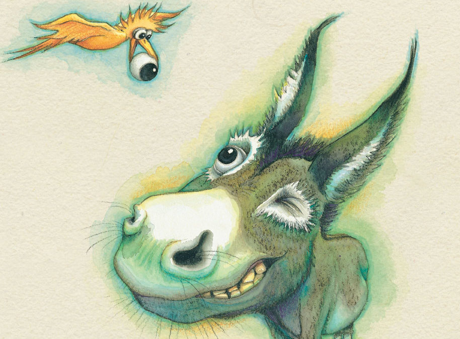
Penny also included this rough illustration with her email, done by the illustrator, Katz Cowley.
I don’t remember this meeting, but it must have been a goodie, because look where we are now! I know Craig Smith joined me on the marketing committee I was chairing for Te Tai Tamariki Trust at the time, so we must have hit it off.
This is the Te Tai Tamariki logo we designed from that time. I still love its simplicity, even today. The organisation is now called Painted Stories and comes under the New Zealand Storylines banner, so you can still look them up.
Getting started
After that meeting, we got to work! It all kicked off with a font choice from Penny.
31 March 2009
Email from Penny
Subject: Font
Have just seen a font in a [Scholastic Australia] title that I think might be the right one for Wonky Donkey – it’s called ‘Drawzing’.
A screenshot of the “Drawzing” font recommended by Penny.
31 March 2009
Email from Anita, Smartwork Creative book designer
Subject: Re: Wonky Donkey
This looks like a good font! I really like the texture and it’s still very legible. The character map looks like it is complete too. It doesn’t have an italic though, will this be a problem?
Fun fact: a character map is the list of characters (letters, punctuation, symbols, and so on) designed for a font. Complete character map = happy designers.
Apart from deciding on a font, the rough illustrations also gave another idea:
7 April 2009
From Penny
Subject: Cover Design
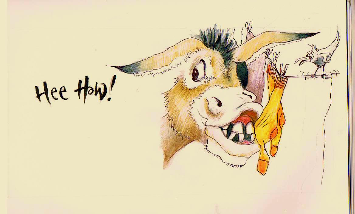
Is there any way you can stick her [Katz the illustrator] big Hee-Haw into this? She is very much a beginner (her first book) and needs all the help she can get with text layout. If you can space out each page layout as it’s going to look in the book, that would be great. (page specs are 250mm x 240mm on this one, by the way – just in case I’ve never told you that!)
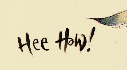
Katz’s handwritten “Hee Haw!” from the rough illustrations.
The artwork
28 April 2009
Email from Kim Dovey, Smartwork Creative
Subject: Artwork
Just picked up the artwork – it’s brilliant.
Reply from Penny
Kewl.
The illustrations had so much detail and they really jumped off the page. Our initial meeting with Katz helped her work out where the centre of the spreads would be (e.g. you don’t want any juicy stuff falling into the gutter at the centre of the book), and how much space was needed so we could fit the words in.
The art paper Katz used had a great texture to it, but it couldn’t be picked up by even the best scanner operator. So we decided to reproduce the texture, to keep that ‘down on the farm’ feel which matched the gorgeous donkey. We had so much fun finding the right textured background and clear-cutting out Wonky’s poses and friends to make the blend as seamless as possible.
Here’s how the scanned artwork looked like after placing on top of the new textured background.
7 May 2009
Email from Penny
Subject: First proofs
Just received The Wonky Donkey pic … and he’s VERY green … don’t actually know that I like all that green … donkeys are a nice soft brown colour.
Is he green like this all the way through the book?
Kim’s reply to Penny
Not a wonky donkey. He’s beautiful. Will have to wait to get the artwork back though to have a closer look at the rest. But will make sure the scanning process doesn’t make him look any greener.
The art is really gorgeous. I don’t think you’d think that if you saw it all as a whole.
The cover design
Now we are up to the fun part of a book design. Well, it’s fun when we can nail it without too much pain. We all know how important a book cover design is, but who would have ever guessed how important this one would be!
Here’s how the process began, with our drafts for the cover design.
And then some feedback from Scholastic:
12 May 2009
Email from Penny
Oooookaaaaay …
Have just had a trans-Tasman call about the cover. Andrew [from Scholastic Australia] wants it to be brighter and funkier.
Wants us to try bright orange for title (like tip of bird’s beak on back cover) and wants title to move up so it’s not touching donkey – also maybe needs a mm or two between ‘y’ of wonky and ‘donkey’. Also would prefer background to be more white, less creamy, if it’s possible to do that please.
Back cover blurb needs to look more fun – and wonky. Perhaps the first section of the blurb could even go round inside the donkey’s rump somehow – reversed out, or in the bright orange perhaps? And the words ‘wonky donkey’ need to be bolder and wonkier. Then the award-winning song bit could run across the top of the back cover – and maybe use the Apra logo there as well.
If you have any better suggestions for the back cover (we’re not sure if the text in the rump is gonna work), then please fire them through!
Ciao
12 May 2009
Email from Anita
Hi Penny,
Here goes round 2 of wonky donkey…
I have put a sample of the cd in the flap so you get an idea of what it looks like. We feel the CD cover needs to be a slightly different colour to the cover/flaps due to the fact they go through different printing processes …. we don’t want them to come out different colours by accident…
Proof 2 of the cover, now with flaps and a CD.
Now things really started to hot up with a long phone call with Australia and a bit of a twist, which set the cat amongst the pigeons. (In other words, they asked us to try a blue cover instead.)
15 May 2009
Email from Anita
Hi Andrew,
Here goes the brighter blue cover. The author/illustrator names are a bit hard to read so I’ve included a sample with these in white too. Let me know what you think. Don’t hesitate to call if you need.
Cheers
Anita 🙂
The first cream cover and the new blue cover.
Email from Andrew, Scholastic Australia
Hi Anita,
We like the blue background. Would you be able to try a bright yellow as the title, and then try the same yellow for the author name, illustrator name, and the text on the top of the back cover?
Thanks,
Andrew
And so we did…
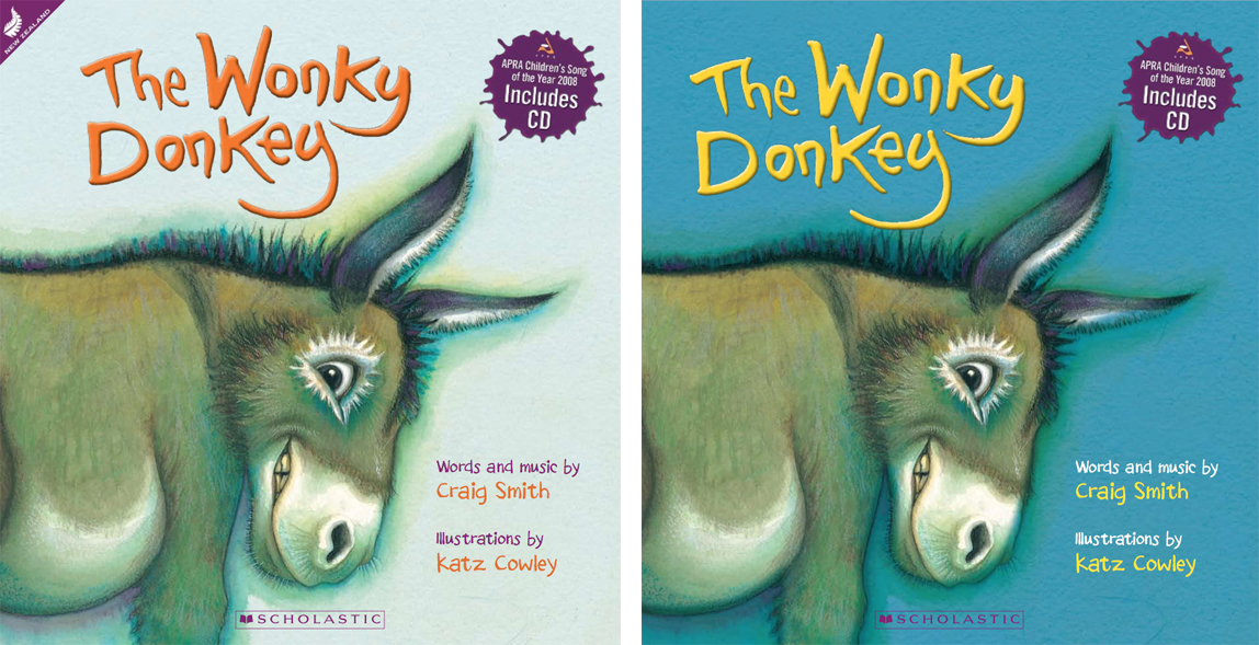
That blue cover wasn’t everyone’s favourite choice at the time, but that’s just the process of design. I did come across one email comment that I’ll leave anonymous. 🙂
Scholastic now had the tough choice of choosing between two great cover designs, but eventually we had a winner:
18 May 2009
Email from Penny
Well, the decision is pretty much split 50/50 on the cream cover or the blue one, but we’ve decided to keep it simple and go with the Aussies and have a blue one too – then if we ever run out of stock, it’s easy to pick up some of theirs.

The final cover of Wonky, ready for print.
Finding this email sequence has made it worthwhile maintaining that back-up system for all these years. And there have been many, many books between then and now with the Scholastic team and Craig Smith’s self-published books, but this journey with Wonky has really been one in a million.
19 September 2018
Email from Kim Dovey
LOOK WHAT I’VE FOUND – so funny
Reply from Penny
Oh wow! How cool. Ahhhh, takes me back …